A great monthly report does more than just list numbers; it tells the story of your performance, turning raw data into something your boss can actually use. The best ones I’ve seen are sharp, easy on the eyes, and answer the “so what?” for every single metric.
1. Beyond Data Dumps: Why Most Reports Fail
Let’s be real for a second: most monthly reports get ignored. They become a box-ticking exercise for the person writing them and a one-way ticket to an unread folder for everyone else.
This usually happens when reports are just “data dumps”—endless pages of metrics with zero context, no analysis, and no clear point. The problem isn’t the data; it’s the failure to turn those numbers into a narrative about what’s actually happening.
A report filled with disconnected stats helps no one. It doesn’t guide leadership decisions, it doesn’t inform strategy, and it definitely doesn’t show off your team’s hard work. You have to reframe your thinking. A monthly report isn’t just an obligation; it’s your best tool for proving your impact and starting important conversations.
From Unread to Influential
I once worked with a marketing team that sent out a dense, 10-page report packed with every metric you could imagine. No one read it. Engagement was zero. They decided to switch things up, creating a one-page visual summary that highlighted three key wins, one big challenge, and crystal-clear recommendations for the next month.
The new format was a game-changer.
Stakeholders could finally understand the entire month’s performance in less than five minutes. That clarity led to better discussions and, ultimately, helped the team secure a budget increase because their value was suddenly impossible to ignore.
The purpose of a report is not to be long, but to be long remembered. It should spark a conversation, not end one.
This is what happens when you prioritise insights over raw information. Instead of just saying website traffic went up, a killer report explains why it went up and what that means for the business.
This chart drives the point home. It shows the massive gap between typical reporting and reporting that actually makes a difference. Most reports don’t influence decisions, which means they’re not helping you get the resources you need.
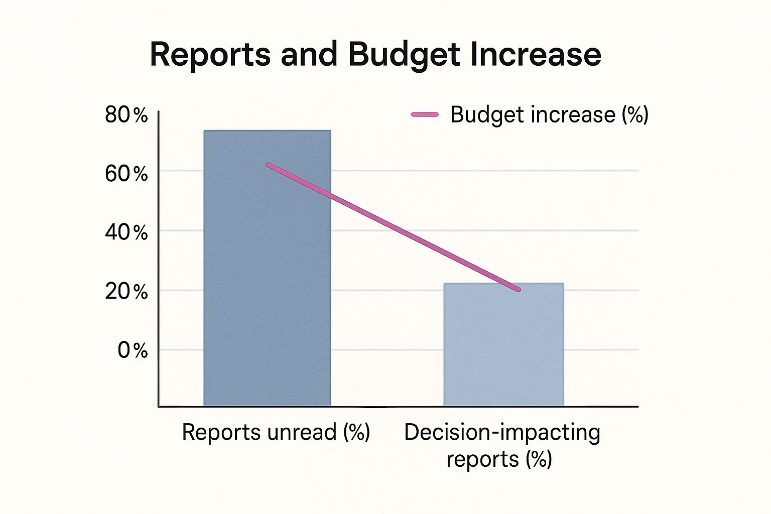
The numbers don’t lie: a shocking 70% of reports go unread. Meanwhile, only a quarter of them actually help with decision-making, which is directly linked to a tiny 15% chance of a budget increase. Your goal is to create a report that lands squarely in that top 25%.
2. The Anatomy of a High-Impact Monthly Report

A great monthly report isn’t some mysterious art form; it’s a well-oiled machine built for clarity and action. You’ve got to move beyond just listing off metrics. Each piece of your report should have a clear job, guiding your reader from the 30,000-foot view right down to the details that actually matter.
Think of it as building a case. You’re not just showing what happened. You’re proving your team’s value, justifying the strategy, and paving the way for what comes next. Any high-impact monthly report sample you see will have a logical flow that respects the reader’s time while delivering the goods.
Before we dive into the play-by-play, let’s map out the essential components. A solid report structure is non-negotiable—it’s what separates a useful document from a digital paperweight.
Core Elements of an Effective Report
| Section | Purpose | Key Information to Include |
|---|---|---|
| Executive Summary | Deliver the most critical takeaways upfront for busy stakeholders. | Big wins, major challenges, and a top-line performance verdict. |
| KPI Dashboard | Provide a quick, visual snapshot of performance against targets. | Key metrics with MoM/YoY comparisons and progress-to-goal visuals. |
| Highlights & Wins | Showcase successes and explain what drove them. | Specific campaign results, positive trends, and team achievements. |
| Challenges & Learnings | Address setbacks transparently and demonstrate proactive problem-solving. | Underperforming areas, what was learned, and corrective actions. |
| Next Month’s Focus | Outline upcoming priorities and strategic initiatives. | Key projects, campaign launches, and strategic adjustments. |
This framework ensures that anyone, from the CEO to a new team member, can grasp the month’s story quickly and understand where you’re headed.
Start with a Punchy Executive Summary
Let’s be honest, this is probably the most crucial part of the entire document. Your C-suite is swamped. They might only read this section, so it needs to be a powerful, concise snapshot of the month.
Your summary needs to instantly answer three questions:
- What were our biggest wins?
- What were the main roadblocks we hit?
- What’s the final verdict on this month’s progress?
Keep it tight—one or two short paragraphs at most. Use direct, confident language and lead with your most impressive numbers. For instance, don’t just say “we saw good growth.” Instead, hit them with: “We increased new leads by 22%, smashing our target of 15%.”
A great executive summary tells the whole story in under a minute. If your reader only sees these first few sentences, they should still walk away with a clear understanding of the month.
This top-down approach makes sure your key messages land, even with stakeholders who have zero time to spare.
Contextualise Your Key Performance Indicators
Just dropping a list of Key Performance Indicators (KPIs) into a report is a classic rookie mistake. A number like “5,000 website visitors” is completely meaningless on its own. To give your metrics any real power, you have to frame them with clear benchmarks.
Always show your numbers in context:
- Month-over-Month (MoM) Growth: How does this month stack up against the last?
- Year-over-Year (YoY) Growth: Are we seeing genuine long-term progress?
- Performance Against Goal: How close are we to actually hitting our targets?
This kind of context is everything. Think about it—government bodies do this all the time to show economic trends. For instance, Statistics South Africa (Stats SA) releases dozens of monthly reports on everything from manufacturing to retail sales. They don’t just give a number; they show how it fits into the bigger picture of provincial GDP and national trends. It allows for sharp analysis because the data has historical weight, a practice every single business report should adopt.
Frame Challenges as Opportunities
Look, no month is ever perfect. A report that only shines a light on the wins feels fake and erodes trust. Tackling challenges head-on shows you’re not hiding anything and, more importantly, that you’re thinking strategically. The trick is to frame them not as failures, but as valuable lessons.
So, instead of a flat statement like, “Our social media campaign failed to generate leads,” reframe it as a learning experience.
Try this: “The LinkedIn ad campaign underperformed against our lead generation target. Our analysis shows the creative resonated poorly with the target audience. Next step: We will A/B test new messaging focused on customer pain points in next month’s campaign.”
See the difference? This approach shows you’re proactive, in control, and already working on the solution.
3. Finding the Story in Your Data

Here’s the thing about powerful reports: they’re built on insights, not just numbers. To stop your monthly report from being a data-dump that gets skimmed and forgotten, you have to become a storyteller. Your data is the raw material, but the magic happens when you connect the dots.
Your real job is to answer the “so what?” for every single metric you share. Don’t get lost in the endless sea of data from Google Analytics or your CRM. Instead, hunt for the information that speaks directly to your goals for the month. That’s how you turn a dry spreadsheet into a strategic narrative.
Think of it this way: anyone can state that website traffic went up by 15%. A real analyst digs deeper. They explain why it went up—maybe that new blog series on sustainable business practices is resonating, proving there’s a real appetite for that topic among your target audience. That single insight is infinitely more valuable than the raw number.
Moving Beyond Surface-Level Metrics
To find these stories, you have to look for relationships. A single metric floating on its own is practically useless. The gold is in comparing, segmenting, and correlating your data to see the trends hiding beneath the surface.
Here are a few ways to start digging:
- Segment Your Audience: Don’t just report on total leads. Break them down. Where did they come from? Organic search, social media, referrals? If one channel suddenly smoked the others, that’s the story.
- Analyse Behavioural Flow: Use your tools to watch how people actually move through your website or app. Where are they getting stuck and bailing? What content hooks them? This shows you exactly where the friction is.
- Correlate Activities with Outcomes: Did the sales team’s big push on a certain product line actually lead to a revenue spike in that category? Connecting actions to results is the entire point of reporting.
For example, a platform like CRM Africa lets you see which proposals get the most views and then cross-reference that with the ones that actually get signed. You might find that proposals with video embeds have a 30% higher close rate. Now that is a powerful, actionable insight you can run with.
The most impactful reports don’t just present data; they interpret it. Your job is to translate numbers into a clear narrative of what worked, what didn’t, and what you should do next.
This approach forces you to ignore the vanity metrics and focus on the numbers that actually drive business decisions.
Connecting Data to Business Goals
Every number in your report needs a reason to be there. Before you pull a single piece of data, go back to your company’s main goals for the month. Was the priority to boost customer retention? Shorten the sales cycle? Improve project profitability?
Let those goals be your guide.
- For a retention goal: You should be looking at customer engagement scores, how quickly support tickets are resolved, and repeat purchase rates.
- For a sales cycle goal: Analyse the time deals spend in each stage of your pipeline. Pinpoint the bottlenecks where everything grinds to a halt.
- For a profitability goal: Track billable vs. non-billable hours. Compare project budgets to the actual costs.
Aligning your data this way ensures your report is a strategic tool, not just a collection of fun facts. It demonstrates progress against what the business actually cares about. This is the whole idea behind modern business intelligence tools like Power BI—they’re designed to create dashboards that link day-to-day data directly to top-level strategic objectives.
When you frame your data around these core goals, your report stops being just informative and becomes persuasive. You’re showing stakeholders exactly how your team is moving the needle, making your value undeniable and turning your monthly report sample into a blueprint for success.
4. Designing Reports That People Actually Read

Let’s be honest. You can have the most groundbreaking data in the world, but if it’s buried in a wall of text, it might as well not exist. The best reports don’t just dump numbers on a page; they make those numbers impossible to ignore. This is where smart design and clear business storytelling come into play.
Your real goal is to turn a dense monthly report sample into a visually compelling journey. One that even the busiest executive can understand in a 60-second glance. It’s all about respecting their time and pulling their focus to the insights that actually matter. Think clean, simple, and purposeful.
Choosing the Right Chart for Your Data
Data visualisation is your secret weapon for cutting through complexity. The trick is to match the right type of visual to the data you’re presenting. Using the wrong chart is a classic mistake—it doesn’t just look bad, it actively hides the very point you’re trying to make.
Here are some of my go-to choices:
- Line Charts: These are perfect for showing trends over time. Use them to track key metrics like revenue, website traffic, or customer acquisition month-over-month. Nothing tells a growth story better.
- Bar Graphs: Use these for straight-up comparisons between different categories. Think comparing lead sources or the performance of different marketing campaigns. It’s a direct, no-nonsense visual.
- Pie Charts: Handle with care. Use these only when you need to show parts of a whole, like the percentage breakdown of a budget. Even then, a bar graph is often clearer and easier to read.
Imagine you’re reporting on agricultural forecasts. A simple bar graph could instantly show the projected 2025 commercial maize crop of 14.64 million tons next to the previous year’s 12.85 million tons. That visual makes the 13.96% increase jump off the page. This kind of clarity is critical in every sector, and you can see how government bodies present complex information by checking out insights on South Africa’s food security outlook.
Keeping It Clean and Scannable
Cluttered reports are unread reports. Full stop.
Your design should create a sense of order and make key information pop. Use generous white space, clear headings, and a consistent colour scheme to create a professional document that’s easy to follow.
A well-designed report guides the eye. It uses visuals not as decoration, but as tools to deliver insights faster and with greater impact.
Break up long sections. Use bullet points or callout boxes to highlight the absolute must-know takeaways. If a stakeholder only scans your report for 30 seconds, they should still grasp the main points because your design forced them to stand out.
Telling a Cohesive Visual Story
Your visuals shouldn’t be random; they need to work together to tell a story.
Start with a high-level dashboard that gives the big picture. From there, use more detailed charts in the following sections to drill down into specific areas. For example, an initial pie chart could show your overall sales breakdown by region.
Right after that, you could use a series of bar graphs to dive deeper into the top-performing region, showing which products drove that success. This logical flow helps your audience connect the dots, moving from the 30,000-foot view to the granular details without feeling overwhelmed.
This approach transforms your report from a simple update into a powerful tool that drives strategic conversation.
5. Your Free Monthly Report Sample and Template
Let’s be honest, all the theory in the world doesn’t help much when you’re staring at a blank page. It’s time to stop talking and start doing. I’ve put together a tool to shortcut the entire process and instantly level up your next report.
This isn’t just another file I threw together. It’s a fully customisable monthly report sample that I’ve refined over years of figuring out what actually gets read and acted on. Think of it as your starting point for creating reports that are sharp, concise, and genuinely impactful.
You can grab it in two flavours, depending on your team’s workflow:
- Google Docs: Perfect for when you need to dig deep into the details and weave a compelling narrative around your data.
- Google Slides: The go-to for more visual, presentation-ready reports that you can easily walk through in a meeting.
Both versions come pre-built with the high-impact structure we’ve already covered—from that punchy executive summary right down to the forward-looking action plan. I designed them to be plug-and-play.
How to Make the Template Your Own
The real power here is in how easily you can adapt it. The template is loaded with placeholder text and guiding questions in each section, forcing you to think beyond just the numbers and get to the story behind them.
For example, in the “Challenges & Learnings” section, you won’t just see an empty box. Instead, you’ll get prompts like: “What was our biggest roadblock this month, and what single lesson can we apply next month?” This is how you shift from simply stating a problem to demonstrating strategic thinking.
The point of a template isn’t to box you in—it’s to give you a proven framework. Use it as a launchpad to tell your team’s unique story with clarity and confidence.
The charts are also ready to go. Just plug in your numbers, and the visuals update automatically. It saves a ton of time. It doesn’t matter if you’re in sales, marketing, or project management; you can easily rename and adjust the sections to fit your specific KPIs.
This thing is built for you to use right now. Your next report doesn’t have to be a grind. Download the template, follow the prompts, and put your energy where it actually counts: uncovering the insights that will push your business forward.
6. Your Top Reporting Questions, Answered
Look, even with the best templates and intentions, nagging questions always pop up when you’re trying to finalise your monthly report. It’s those little details that can slow you down and make you second-guess yourself.
Let’s clear the air and tackle the most common sticking points head-on. Getting these right will give you the confidence to build reports that don’t just look professional, but actually land with impact. The goal here is to move you from just dumping data into a doc to telling a persuasive story about your team’s performance.
How Long Should a Monthly Report Actually Be?
There’s no magic number, but here’s the rule I live by: concise, yet comprehensive.
Your best bet is a powerful one-page executive summary, followed by no more than three to five pages of the nitty-gritty details. This structure shows you respect everyone’s time while still providing the depth needed for real analysis.
Remember your audience:
- Senior Leadership: They’re time-poor. They will probably only scan the executive summary for the big picture. Make your major wins and critical challenges impossible to miss, right at the top.
- Your Direct Manager: They need the details to understand what’s driving performance. The follow-up pages are for them—giving them all the context and data they need to have a meaningful conversation with you.
If you find your report creeping past six or seven pages, that’s a red flag. It’s a sign that you’re including too much raw data in the main body. Don’t be afraid to shove bulky data sets or super-granular charts into an appendix. It keeps your report clean, focused, and scannable.
What Are the Biggest Mistakes People Make?
Funny enough, the worst reporting mistakes have almost nothing to do with the data itself. They’re all about context and focus.
Watch out for these classic traps:
- Data Without Context: A number like “500 new leads” is completely meaningless by itself. Is that amazing? Terrible? You have to frame it. Always compare your numbers to last month, last year, or the target you were supposed to hit. Without a benchmark, data is just noise.
- Chasing Vanity Metrics: Sure, social media likes and impressions look nice on a chart, but they rarely connect to actual business goals. You need to prioritise metrics that show real-world impact—things like conversion rates, cost per acquisition, or customer lifetime value.
- Only Looking Backwards: A report is not just a history lesson. It should build a case for what to do next. Every finding you present should lead to a clear, actionable recommendation for the upcoming month.
Here’s a simple test: for every single chart or metric you include, ask yourself, “So what?” If you can’t answer that question instantly and clearly, that piece of information doesn’t belong in your report. Cut it.
How Do I Make My Report More Engaging?
Simple: tell a story.
Instead of just listing facts, frame the month’s performance as a narrative. Give it a beginning, a middle, and an end. Kick things off with a strong executive summary that sets the scene—the big win you achieved, the unexpected challenge you faced, and the final outcome.
Use descriptive headings to guide your reader through the story, not just “Marketing Metrics” or “Sales Data.” And for goodness’ sake, ditch the corporate jargon. Write like a human. This one change alone can turn a dry monthly report sample from a chore to read into a strategic tool that people actually pay attention to.
Ready to stop building reports from scratch and start creating strategic assets? With CRM Africa, you get built-in analytics and reporting tools that make it easy to track your performance, find your story, and share your impact. Centralise your sales, projects, and invoicing in one place and get the insights you need faster. Explore the platform at https://crm.africa.