
Ever tried explaining a complex business process to someone? It often ends in a confusing mess of jargon and tangled steps. This is where a data flow diagram (DFD) becomes your best friend.
Think of it as a simple, visual map. Instead of showing roads, it shows how information moves through a system. It tracks data from its starting point, through all the steps that change it, to its final destination—all without getting bogged down in technical details. This approach was pioneered by early software engineering theorists like Larry Constantine and Ed Yourdon in the 1970s as part of structured design methods (Yourdon & Constantine, 1979).
1. What Is a Data Flow Diagram
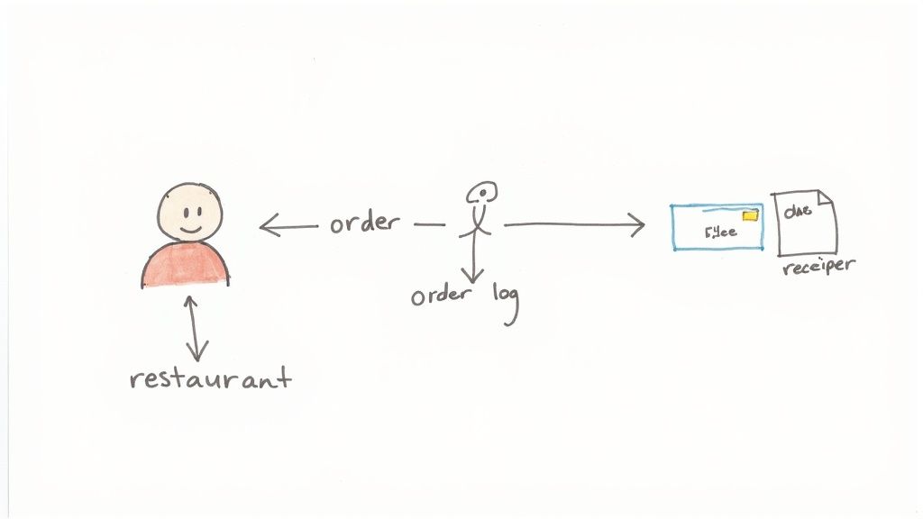
Imagine trying to describe a restaurant’s ordering system using only words. You’d have to explain customer orders, kitchen tickets, payment slips, and stock updates. It would be chaotic. A DFD cuts through that noise with a clear, easy-to-read chart.
The diagram would show the customer (the source of the data) placing an order. This “order data” then flows to a process like “Take Order,” which transforms it into a kitchen ticket and a bill. The ticket goes to the kitchen, the bill to the payment system. Simple.
This is the real power of a DFD: it focuses on what the system does with information, not how it does it. It ignores the specific software or hardware, giving everyone—from developers to managers—a high-level view they can actually understand (Gane & Sarson, 1979).
By visualising the journey of information, a data flow diagram creates a single source of truth. It bridges the communication gap between business analysts, software developers, and stakeholders, ensuring everyone is aligned on the system’s objectives (Whitten & Bentley, 2007).
Why DFDs Are Crucial for Project Success
Misunderstandings kill projects. When teams aren’t clear on how data should be handled, you get delays, budget blowouts, and a final product that doesn’t work as intended. A solid DFD is the blueprint that prevents this chaos before a single line of code is written (Pressman, 2010).
This visual clarity is especially vital in South Africa’s booming software development scene. In fact, local research from the University of Cape Town shows a direct link between using DFDs and better project outcomes. The study found that projects using DFDs in their planning stages had a 32% higher success rate in hitting deadlines and performance targets. That’s a huge deal in an industry where unclear requirements have historically plagued projects.
The Main Benefits of Using a DFD
When you map out the entire data journey, your team suddenly gains a massive advantage. Here’s what you unlock:
- Improved Communication: DFDs create a common language. Marketing, engineering, and sales can finally get on the same page with a shared vision (Kendall & Kendall, 2010).
- Clearer System Scope: They draw a line in the sand, showing exactly what your system does and what it doesn’t. No more scope creep.
- Identification of Inefficiencies: Once you see the flow, the weak points jump out. Bottlenecks, redundant steps, and missing links become obvious problems you can fix.
- Enhanced Documentation: A good DFD is priceless documentation. New hires can get up to speed quickly, and future maintenance becomes far less painful.
2. Decoding the Four Core DFD Components
Here’s the good news: no matter how complex a system looks, every data flow diagram is built from just four simple symbols. That’s it.
Think of them as the alphabet for mapping data. Once you know them, you can read and write any data story, from a simple customer query to a sprawling enterprise process. We’ll be looking at the Gane and Sarson notation, which is one of the most common and intuitive ways to draw DFDs (Gane & Sarson, 1979).
To make this real, we’ll walk through each symbol using a familiar example: a university’s student registration system. This will help us see how these individual building blocks connect to create a picture that actually makes sense.
Let’s get into it.
The Four Key Symbols
To break down how these diagrams work, let’s look at each of the four core components. They each have a specific job to do in telling the story of how data moves through a system.
The table below gives you a quick snapshot of the Gane & Sarson symbols we’ll be exploring.
Key Symbols in a Data Flow Diagram (Gane & Sarson Notation)
| Component | Symbol | Description & Example |
|---|---|---|
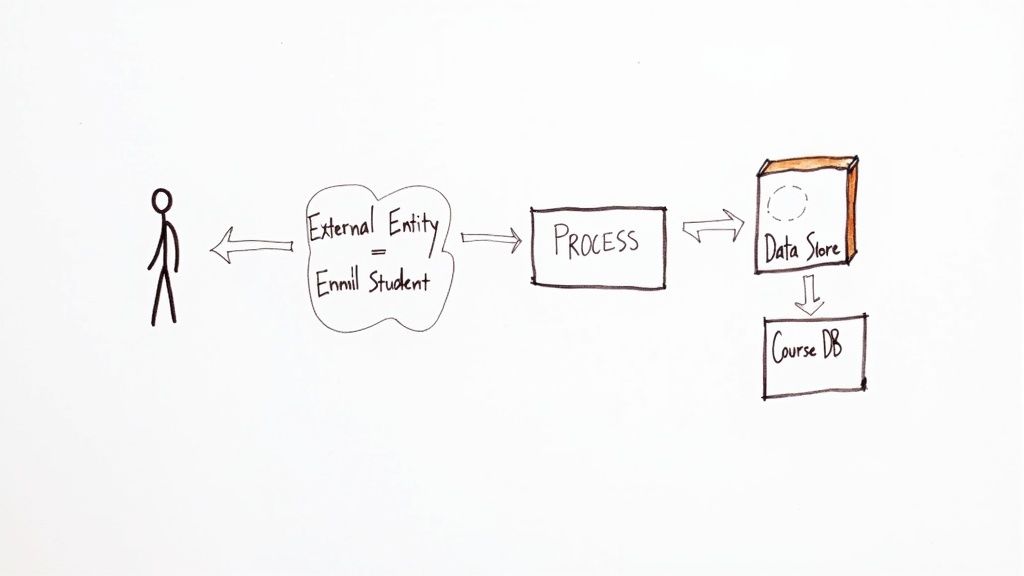
| External Entity | Rectangle | Anyone or anything outside the system that sends or receives data. Example: A Student submitting an application. |
| Process | Rounded Rectangle | An action that changes or transforms data. Example: The “Verify Student Details” action. |
| Data Store | Open-Ended Rectangle | Where data is kept for later use, like a database or file. Example: The “Student Records” database. |
| Data Flow | Arrow | The path data takes between entities, processes, and stores. Example: An arrow labelled “Registration Form“. |
Now that you’ve seen the cheat sheet, let’s dive into what each of these components really means in practice.
External Entities: The Outsiders
An external entity is anyone or anything that lives outside the system you’re mapping but still interacts with it. They are the sources of your data and the destinations for your outputs. Think of them as the start and end points of your data’s journey.
Typically shown as a rectangle, an entity could be a person, another department, or even a completely separate computer system. As the team at RudderStack, a data infrastructure platform, points out, they define the boundaries of your system.
In our university registration example, the key external entities are pretty obvious:
- Student: The person sending in their registration info and getting a class schedule back.
- Admissions Office: A separate department that provides the initial list of accepted students.
- Finance Department: Another system that needs to receive data about tuition fees.
They aren’t part of the registration process itself, but the process can’t work without them.
Processes: Where the Action Happens
This is where the magic happens. A process is an action that takes incoming data and actually does something with it. It transforms the data in some meaningful way. Visually, it’s a circle or a rounded rectangle, always described with a strong action phrase (DeMarco, 1979).
Think “Verify Student ID,” “Calculate Tuition,” or “Generate Class Roster.”
A process can’t just exist on its own; it has to have at least one piece of data coming in and one piece going out. In our university system, when a student submits their course choices, the “Register for Courses” process is what turns that request into a confirmed class schedule.
As guidance from the Federal Financial Institutions Examination Council (FFIEC) highlights, DFDs are designed to show “how the entity’s data flows between critical hardware on the network, not just where a piece of hardware resides.” It’s all about the transformation, not just the location. This is a point echoed by experts at SBS CyberSecurity.
Data Stores: Where Information Rests
Data is rarely a one-and-done deal. It often needs a place to hang out before being used again. That’s the job of a data store, represented by two parallel lines or an open-ended rectangle.
A data store can be anything from a massive database to a simple spreadsheet or filing cabinet. It’s any place information is held (Senn, 1989).
Here’s the critical rule: data can’t just jump from an external entity straight into a data store. It always has to pass through a process first. The process is the gatekeeper.
For our university example, we’d likely have a few key data stores:
- Student Records: The main database holding every student’s personal details and academic history.
- Course Catalogue: A list of all available courses, their prerequisites, and schedules.
Data Flows: The Highways for Information
Finally, we have the data flows. These are the arrows that connect everything else. They are the roads that data travels on, moving between your entities, processes, and data stores.
Each arrow is a one-way street and must have a clear label describing exactly what information is moving. You can’t just draw an arrow; you have to name it. Labels like “Registration Request” or “Verified Student ID” are essential.
These labels are what bring the diagram to life. They show the precise journey, turning a collection of shapes into a clear story of how a “Course Selection” from a student eventually becomes a “Class Roster” saved in a data store. Without them, you just have a meaningless web of boxes and circles (Yourdon, 1989).
3. Navigating the Different DFD Levels
A data flow diagram isn’t a single, rigid map of a system. Trying to cram every last detail into one drawing would be a recipe for confusion. Instead, DFDs use a clever layering system to keep things clear.
Think of it like Google Maps. You start with a view of the whole country, then zoom in to see a province, then a city, and finally the street you’re looking for. This technique, known as levelling or decomposition, lets you show the right amount of detail to the right audience (Whitten & Bentley, 2007).
This layered structure means you can present the same system in different ways. Executives get the high-level overview they need, while developers can dive deep into the nuts and bolts. As the team at RudderStack aptly puts it, this progressive detail helps everyone manage complexity without getting overwhelmed.
Let’s walk through a classic example—an online e-commerce order system—to see how a simple process gets “exploded” into more detailed diagrams at each level.
Level 0: The Context Diagram
Everything starts at Level 0, the Context Diagram. This is your 30,000-foot view. It shows the entire system as one single process bubble, highlighting only how it interacts with the outside world (the external entities).
The goal here is simple: define the project’s boundaries. It answers the big question: what does this system do, and who or what does it talk to? No internal complexity, no implementation details. Just the core function (Kendall & Kendall, 2010).
For our e-commerce site, the Level 0 diagram is wonderfully simple:
- A single process bubble: “Process Customer Order.”
- External entities: “Customer,” “Warehouse,” and “Payment Gateway.”
- Data flows: The customer sends in “Order Details,” the system sends a “Payment Request” to the gateway and a “Shipping Request” to the warehouse, and finally, sends an “Order Confirmation” back to the customer.
That’s it. It’s the perfect diagram for stakeholders who don’t need to know how the magic happens, just that it does.
Level 1: Exploding the View
With the big picture established, we zoom in to the Level 1 DFD. This is where we “explode” that single process from Level 0 into its main sub-processes. For the first time, we get to see the major functions happening inside the system and introduce the data stores where information is kept.
A key rule here is that the Level 1 diagram must stay consistent with its Level 0 parent. All the external entities and the overall data flowing in and out of the system must match perfectly. The only difference is we’re now peeking inside the “Process Customer Order” bubble.
Our e-commerce example might break down into these main steps:
- Verify Order: Checks if the items are in stock and the customer’s details look right.
- Process Payment: Securely communicates with the Payment Gateway to handle the transaction.
- Update Inventory: After a successful sale, it reduces stock levels in our “Inventory” data store.
- Confirm Order: Fires off that confirmation email to the customer and tells the warehouse to get shipping.
One of the most important rules in DFDs is balancing. The data flowing into and out of a process on a parent diagram (like Level 0) must exactly match the total data flowing into and out of its child diagram (Level 1). This ensures your diagrams remain consistent as you add more detail (Yourdon, 1989).
Level 2: Drilling Down Further
Sometimes, even a Level 1 process is too chunky. What if “Verify Order” is actually a complex beast involving multiple checks and balances? That’s your cue to drill down again to a Level 2 DFD.
A Level 2 diagram takes a single process from Level 1 and explodes it further. You don’t need to do this for every process—only the ones that are still too complex to be understood at a glance. The idea is to keep breaking things down until each process represents a single, clear task. We call this a functional primitive.
Exploding our “Verify Order” process at Level 2 might reveal these smaller tasks:
- Check Stock Levels (which talks to the “Inventory” data store).
- Validate Customer Address (which might check against a “Customer Records” data store).
- Calculate Shipping Costs.
You could theoretically keep going to Level 3, Level 4, and beyond, but it’s rare. Most systems are perfectly well-documented with just Levels 0, 1, and 2. Knowing when to stop is the real skill—you want a diagram that’s insightful, not an encyclopaedia (Satzinger, Jackson & Burd, 2011).
Alright, let’s get into the nitty-gritty of actually building one of these things. You’ve got the theory down, so now it’s time to roll up your sleeves and turn a complex process into a simple, visual map. It’s a lot more straightforward than you might think.
We’ll walk through a classic example: a hotel booking system. This will show you exactly how the symbols and rules we’ve discussed snap together to create a tool you can genuinely use.
Step 1: Start with the Big Picture (Level 0)
Every good map starts with a bird’s-eye view. For a DFD, that’s your Level 0 Context Diagram. The goal here is pure simplicity. You want to show the entire system as just one single process and identify everything and everyone it talks to.
First, pin down the system’s main job. For our hotel booking system, it’s just “Manage Hotel Bookings.” That becomes the single bubble right in the middle of your page.
Next, list all the outside parties that send info to the system or get info from it. These are your external entities. Think about it:
- Guest: The person trying to book a room.
- Hotel Reception: The team on the ground that needs the booking info.
- Payment Gateway: The third-party service that handles the money.
Finally, draw the lines—the data flows—that connect these entities to your main process. The Guest sends a “Booking Request,” and the system fires off a “Payment Request” to the Payment Gateway. Simple. This high-level view sets the stage for everything that follows.
Step 2: Break Down the Main Process (Level 1)
Now it’s time to zoom in a level. The Level 1 DFD is where you “explode” that single process from Level 0 into its main sub-processes. This is where you start to show what’s really happening inside the system, and it’s the first time you’ll introduce data stores.
What are the core functions needed to “Manage Hotel Bookings”? You can probably break it down into a few key actions:
- Check Room Availability: The system has to see if the requested dates are even possible.
- Process Guest Payment: It needs to take the customer’s money securely.
- Confirm Booking: This step locks in the reservation and tells everyone involved.
- Update Room Records: The system must mark the room as booked so no one else can grab it.
Each of these becomes a process on your Level 1 diagram. You’ll also bring in your data stores, like a “Room Inventory” database and a “Guest Bookings” log. Just make sure all the external entities and data flows from your Level 0 diagram are still present and accounted for. Consistency is key.
Step 3: Connect the Dots with Data Flows
You have your processes and data stores laid out. Now, let’s trace the journey of the information between them. Every arrow you draw needs a clear label that says exactly what data it’s carrying. This is what makes the diagram actually useful.
For example, a “Booking Request” from the Guest flows into the “Check Room Availability” process. That process then has to look up information from the “Room Inventory” data store. If a room is free, “Payment Details” flow from the Guest into the “Process Guest Payment” process.
One non-negotiable rule: data can’t magically jump between two data stores, or from an external entity straight into a data store. It must always pass through a process. Think of processes as the engines that actually do something with the data (Gane & Sarson, 1979).
Sticking to this rule ensures your diagram is logical and accurately reflects how the system actually works.
This isn’t just for tech companies. Here in South Africa, government bodies use DFDs to manage massive public projects. The South African National Roads Agency (SANRAL), for example, used multi-level DFDs to pull together traffic and incident data from over 200 different sites. Visualising the data flow helped them cut data processing delays by 25% and improve their response time to traffic issues by 18%. It’s proof that a well-made DFD delivers real-world results. You can read more about how these systems support major infrastructure in this appendix on information systems.
This infographic is a great summary of how you peel back the layers, moving from a high-level view to the finer details.
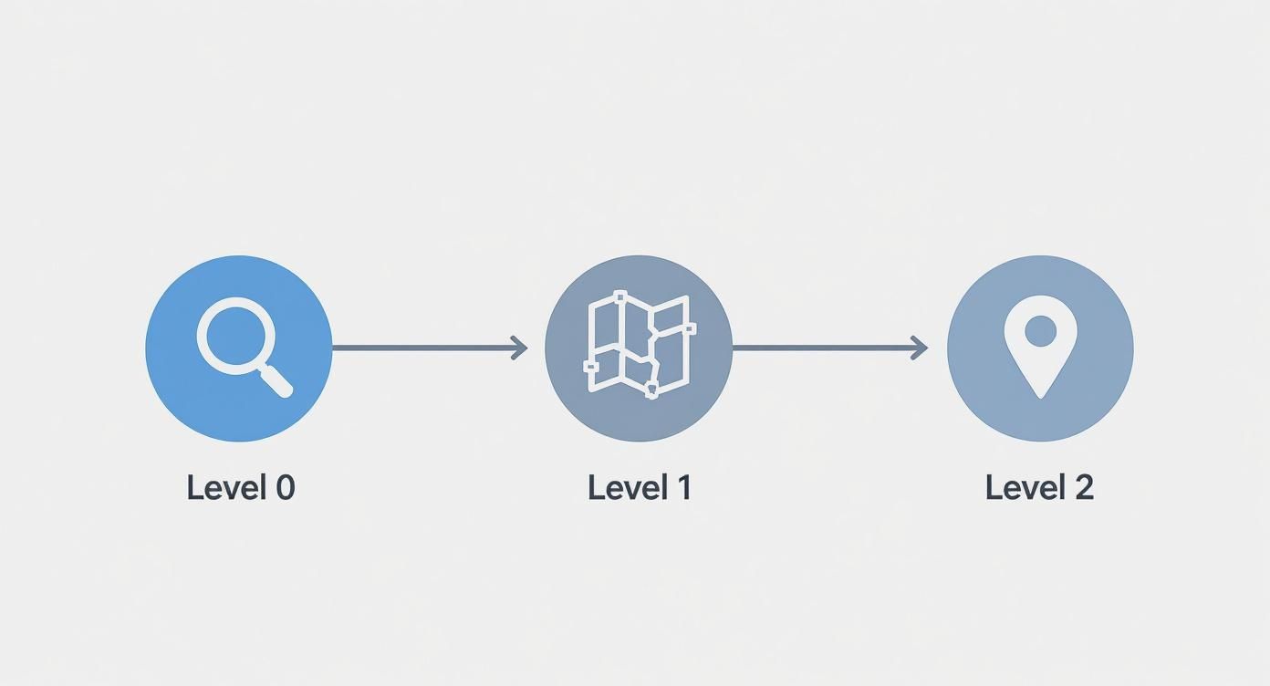
As you can see, the DFD lets you start broad (Level 0), get into the main functions (Level 1), and then dive deep into specific tasks (Level 2).
Step 4: Refine and Validate Your Diagram
You’ve got a first draft. Great. But you’re not done yet. The last step is to review and polish your diagram until it’s crystal clear and accurate. Hunt for common mistakes: arrows with no labels, processes that only take in data but never send any out (a “black hole”), or inconsistencies between the levels (Yourdon, 1989).
Then, show it to people. Get your colleagues and stakeholders to look at it. Do they get it? Does it match how they see the business process? This feedback loop is what turns a technically correct diagram into a genuinely useful tool for the whole team.
4. Data Flow Diagrams in Real-World Business
Knowing the theory is one thing, but seeing how a Data Flow Diagram untangles a real-world business mess is where it really clicks. DFDs aren’t just for textbooks; they’re the tools people use every day to make complex operations simpler, more efficient, and far more reliable.
To really show you what I mean, let’s move past the theory and dive into two detailed, real-world examples. These scenarios show exactly how businesses map, analyse, and ultimately improve the way information moves through their organisation.
Example 1: The Healthcare Clinic
Picture a busy healthcare clinic. A patient’s information journey is incredibly complex. It touches multiple departments, involves sensitive data, and has to follow strict privacy laws. Get it wrong, and you’re facing chaos and compliance nightmares. A DFD is the perfect tool to map this out and keep everything on track.
First, let’s take the 30,000-foot view.
Level 0 Context Diagram for a Clinic
A Level 0 diagram shows the whole system as one single process, showing how it talks to the outside world. Simple, right?
- Process: Manage Patient Visit
- External Entities: Patient, Doctor, Pharmacy, Insurance Company
- Data Flows: The Patient provides their “Personal & Symptom Info.” The system shoots a “Prescription” over to the Pharmacy, a “Claim” to the Insurance Company, and “Medical Records” to the Doctor.
Now, let’s crack that open and see what’s happening inside.
Level 1 DFD for a Clinic
This view breaks down the main process into its core functions. It’s where you start to see the actual internal machinery at work.
- Schedule Appointment: The Patient’s “Appointment Request” comes in. The system immediately checks the “Doctor Schedules” data store and sends a “Confirmation” right back to the patient.
- Record Patient Vitals: During the visit, “Patient Vitals” are captured and saved directly into the “Patient Medical Records” data store.
- Process Billing & Insurance: After the consultation, “Service Details” are used to create an “Invoice” and an “Insurance Claim.” This single process has to talk to both the “Patient Medical Records” and “Billing Information” data stores.
By mapping this out, the clinic can instantly spot where the billing process gets stuck or make sure only authorised staff can access patient data—something that’s absolutely critical for compliance.
In South Africa, the use of structured system analysis tools like DFDs isn’t new. As the country’s digital economy took off, major banks and government bodies started using DFDs to manage the massive data flows needed for online services and to comply with regulations like the Protection of Personal Information Act (POPIA).
This strategic use of diagrams has been a quiet cornerstone of tech growth and data governance in the region for decades. You can find more insights on the role of DFDs in enterprise systems on ibm.com.
Example 2: The Retail Supply Chain
For a retailer, inventory management is everything. If the flow of data between ordering, the warehouse, and delivery breaks down, you get stock shortages, angry customers, and tanking revenue. A DFD is the roadmap that helps visualise and bulletproof this entire chain.
Let’s start with the big picture.
Level 0 Context Diagram for Supply Chain Management
Again, this diagram frames the whole system from a high-level, external perspective.
- Process: Manage Inventory & Fulfilment
- External Entities: Supplier, Warehouse, Customer, Courier
- Data Flows: A “Purchase Order” goes to the Supplier. The Warehouse gets “Stock Updates.” The Customer receives a “Shipping Confirmation,” and the Courier is sent “Delivery Instructions.”
Now, let’s zoom in a level to see the key internal steps.
Level 1 DFD for Supply Chain Management
Here’s where we break down that main process to see how the different parts work together.
- Process Purchase Order: When stock levels dip, this process kicks in. It generates a “Purchase Order” for the Supplier and updates the “Inventory” data store with what’s on the way.
- Receive & Log Stock: Goods arrive from the Supplier. This process validates the “Shipment Details” against the order and updates the “Inventory” data store with the new, accurate stock levels.
- Fulfil Customer Order: A “New Order” arrives. The system checks the “Inventory” data store. If the items are in stock, it creates “Picking Instructions” for the Warehouse and “Delivery Details” for the Courier.
With a clear DFD like this, the retail company can easily pinpoint delays—like the lag between stock arriving and the system being updated—or find ways to improve communication between the warehouse and its couriers. By seeing the complete data journey, businesses can stop guessing and start making smart decisions that lead to smoother, more profitable operations.
5. Got Questions About Data Flow Diagrams? We’ve Got Answers
Once you start trying to map out your own business processes, a few questions always seem to pop up. DFDs are powerful because they have clear rules, but let’s be honest, those rules can be a bit confusing at first.
To clear things up, here are some straight answers to the most common hurdles teams face when they start building DFDs in the real world.
What’s the Real Difference Between a Data Flow Diagram and a Flowchart?
This is easily the most common point of confusion, and the answer boils down to one word: focus.
A data flow diagram is all about the journey of your data. It shows you where information comes from, what your system does to change it, and where it ends up. Think of it as answering the question, “What happens to the information?” (Yourdon, 1989).
A flowchart, on the other hand, is all about the flow of control. It maps out the step-by-step sequence of actions, decisions, and loops in a process. It answers the question, “How does the logic work?” One shows the path of information, the other shows the path of execution.
Can I Just Connect Two External Things Directly?
Nope. This is a hard-and-fast rule in DFDs and a classic rookie mistake. All data has to pass through a process—one of those circles in your diagram. Why? Because a process is where something happens to the data. It gets validated, transformed, or routed.
A direct line between two external entities would mean they’re communicating completely outside of the system you’re mapping. That’s not what a DFD is for.
The same rule applies to your data stores (the parallel lines). You can’t have data magically appear in a database from an outside source without a process putting it there. As the data experts at RudderStack explain, processes are the gatekeepers that act on data, making them a non-negotiable part of any data movement.
Think of a process as the gatekeeper for all data transactions. If data bypasses a process, it means your system has no control or logic over that exchange, which makes the diagram invalid (DeMarco, 1979).
Following this rule forces you to accurately show how your system actually handles information.
How Deep Should I Go With the Levels?
The whole point of levelling is to make complexity manageable, not to document every tiny little action. You should stop breaking a process down into more detail (like going from Level 1 to Level 2) when it represents a single, clear function that everyone on your team understands.
This stopping point is often called a “functional primitive.”
Here’s a good rule of thumb: stop when you can describe what the process does in a simple, straightforward sentence. If breaking it down any further would mean you start describing how it does it (the internal logic, which is a flowchart’s job) instead of what it does, you’ve gone deep enough. Clarity beats exhaustive detail every time (Kendall & Kendall, 2010).
Are DFDs a Bit Old-School for Agile Teams?
Not at all. While DFDs have been around since the days of more rigid methods like the waterfall model, they’re incredibly useful in modern Agile environments. In fact, their ability to give a clean, high-level view of the system is a massive advantage for fast-moving teams.
Here’s how they fit right in:
- Better User Stories: A Level 0 or Level 1 DFD acts like an architectural North Star. It helps product owners and developers see the big picture of how data moves, which is crucial for writing user stories that don’t miss key interactions.
- Smarter Sprint Planning: When planning a sprint, teams can look at the DFD to see exactly how a new feature will affect existing data flows. This prevents nasty surprises and ensures all the necessary connections are accounted for.
- Getting Everyone on the Same Page: A DFD is still one of the best tools for bridging the gap between technical and non-technical people. It creates a shared map of the system that stays relevant even as the nitty-gritty details change from one sprint to the next.
By focusing on the constant—the flow of data—a DFD gives Agile teams a stable foundation to build on, making sure they never lose sight of what the system is fundamentally meant to do.
At CRM Africa, we know that clear data flows are the backbone of any successful business. Our all-in-one platform is designed to centralise your data—from leads and projects to invoices and payments—giving you a complete, 360-degree view of your operations. Find out how you can simplify your workflows and get paid faster at https://crm.africa.